
Color is one of the most powerful tools in interior design—and one of the most emotional. When choosing artwork, color can either blend into the space and reinforce a calm atmosphere, or stand out and become the main focal point of the room.
In this guide, we’ll explore the two main approaches to choosing art by color: harmony and contrast, and how to decide which one works best for your space.
Two Valid Approaches: Harmony and Contrast
There is no single correct way to use color in art. Instead, there are two main strategies:
- Harmony: the artwork shares or echoes the existing color palette of the interior.
- Contrast: the artwork deliberately introduces different or stronger colors to create a focal point.
Both approaches can produce beautiful results—the choice depends on the character of the space and the atmosphere you want to create.
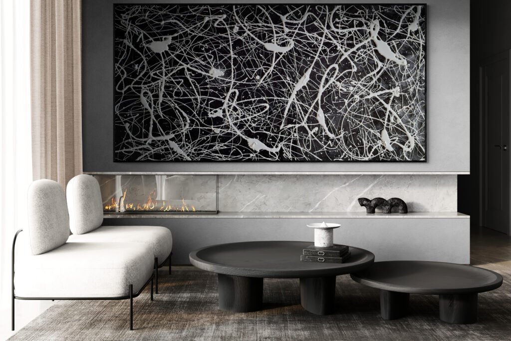
Using Color in Harmony with the Interior
When you choose an artwork in harmony with your interior, the goal is to create a cohesive and calm visual language. The artwork becomes part of the architecture and decoration rather than a dominant statement.
This approach works especially well in:
- Minimalist or calm interiors
- Spaces designed for rest and focus
- Rooms with strong materials and textures
- Elegant, refined environments
In these cases, the artwork reinforces the mood rather than changing it.
Using Color as Contrast and Focal Point
The opposite approach is to use the artwork as a visual anchor that immediately draws attention. Here, color is used to create energy, tension and personality.
This strategy works very well when:
- The interior is mostly neutral or monochrome
- You want one strong, memorable element in the room
- The architecture is clean and restrained
In these spaces, a bold artwork can completely transform the atmosphere without changing anything else.
How to Decide Which Approach Is Right for You
Ask yourself a simple question:
Do I want the artwork to support the space—or to define it?
- If you want the space to feel calm, continuous and elegant, harmony is often the right choice.
- If you want the space to feel expressive, bold or iconic, contrast is usually more effective.
Color and Scale Work Together
Color choices cannot be separated from scale. A small colorful artwork may feel like an accent, while a large-scale colorful piece will completely redefine the room.
If you are unsure about proportions, these guides may help:
Texture and Color: A Powerful Combination
In original abstract art, color is never flat. Texture, layers and material density change how color is perceived depending on light and distance.
This means that even restrained palettes can feel rich and complex, and bold colors can feel deep rather than aggressive.
What If You Want Something Very Specific?
Sometimes a space needs a very precise balance of colors to work with furniture, materials or branding. In these cases, a custom artwork can be the ideal solution.
A commissioned piece allows you to define the general palette, intensity and mood while still leaving room for artistic interpretation. You can explore this option in our Projects section.
Common Mistakes to Avoid
- Choosing colors without considering the overall atmosphere of the room
- Being too cautious and ending up with art that has no presence
- Using strong colors without considering scale and balance
- Trying to match everything perfectly instead of allowing some tension
Why This Matters
Both harmony and contrast are powerful tools. The right choice depends on whether you want the artwork to quietly complete the space or to become its emotional and visual center.
If you want to explore statement pieces, series or custom artworks, you can visit our Projects section.